Optical illusions created by animating images and other element in a Web page are referred as animation. Now create a Web page named animation.html to learn to use the animation property of CSS.
<!doctype html>
<head>
<title>Animation effects</title>
<style type="text/css">
@-webkit-keyframes resize{
0%{
height:220px;
width:220px;
opacity:0.7;
}
50%{
height:240px;
width:240px;
opacity:0.4;
}
}
#heart:hover{
-webkit-animation-name:resize;
-webkit-animation-duration:1s;
-webkit-animation-iteration-count:2;
-webkit-animation-direction:alternate;
-webkit-animation-timing-function:cubic-bezier(0,0.5,0,0);
}
#heartinf{
-webkit-animation-name:resize;
-webkit-animation-duration:1s;
-webkit-animation-iteration-count:infinite;
-webkit-animation-direction:alternate;
-webkit-animation-timing-function:cubic-bezier(0,0.5,0,0);
position:absolute;
left:250px;
top:80px;
width:200px;
height:200px;
}
img{
height:200px;
width:200px;
opacity:1;
}
</style>
</head>
<body>
<h1>
Working with Animation </h1>
<img id="heart" src="heart.jpg">
<img id="heartinf" src="heart.jpg">
<p style="position:absolute;left:60px;top:280px;text-align:center">Hover on this image <br>to animate.</p>
<p style="position:absolute;left:300px;top:280px;text-align:center">Continuously animating <br>image</p>
</body>
</html>
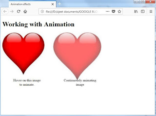
We have applied animation effect on two images.One image animates at the time when we hover the mouse pointer over it, the other image continuously keep animating as we have set the animation-iteration-count property to infinite.
The output of the above Web page is:
The second output shown in figure is continuously animating. Now move your mouse pointer over the first image to start animating it.
As shown in output:


No comments:
Post a Comment